Shafafis are represented by a symbol.
Not a building. Not a garment. Not a beard, a cap, a scarf, or a length of prayer beads. You cannot identify a Shafafi by looking at them, and that is deliberate — a religion that requires a uniform is a religion that requires an audience.
The symbol exists so that Shafafis can recognise one another and so the faith has a mark of its own. It exists instead of architecture.
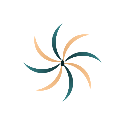
Yes, it’s built from crescents. Eight of them.
The obvious objection: Statues and Pictures already argues that the crescent belonged to Hubal and the other pre-Islamic gods of Arabia before it ever belonged to Islam, and that later Muslims put it on their flags without much comment. We haven’t taken a word of that back.
The problem was never the shape. It was inheriting one frozen copy of it and never looking again — a symbol nobody actually examines anymore, sitting on a flag out of habit rather than conviction. So we didn’t use one crescent. We used the shape a single drop makes when it lands: a ring of curling ripples, eight of them, each one a small crescent in its own right, opening outward from the same point like petals.
That’s not decoration. It’s the same principle behind the Imam’s authority to overturn a prior Ruling, or to abrogate a verse that no longer applies. One event — one drop, one point of revelation — keeps generating new shapes outward from itself, rather than freezing into a single fixed emblem the moment it’s drawn. A religion that cannot revise itself is a museum. We’re not putting a museum piece on our flag.
Reading the mark
Picture a drop hitting still water. The ripple doesn’t move out as a perfect ring — it curls, catches, breaks unevenly. Our mark takes that moment and holds it: eight petal-shaped ripples, each one curved like a crescent moon, spinning outward from a single point of impact at the centre.
It reads as more than one thing at once, on purpose. A flower opening. A whirlpool caught mid-turn. Eight small moons circling a common centre instead of one large one claiming the whole sky. None of those readings is the “correct” one — the mark doesn’t ask you to pick.
The two colours alternate around the circle rather than repeating in a block, the same way light and shade alternate across real moving water. That’s deliberate too: nothing in the mark is meant to sit still.
That’s the whole symbol. Nobody is required to wear it, display it, or even recognise it. It exists for the same reason a flag exists for a country you’ll never visit — so the idea has a shape, if it ever needs one. This one just happens to be a shape that’s still rippling outward.